
04 Sep iPhone 16 vs. 15: Is it really that different?
A designer’s thoughts on the evolution of iPhone design
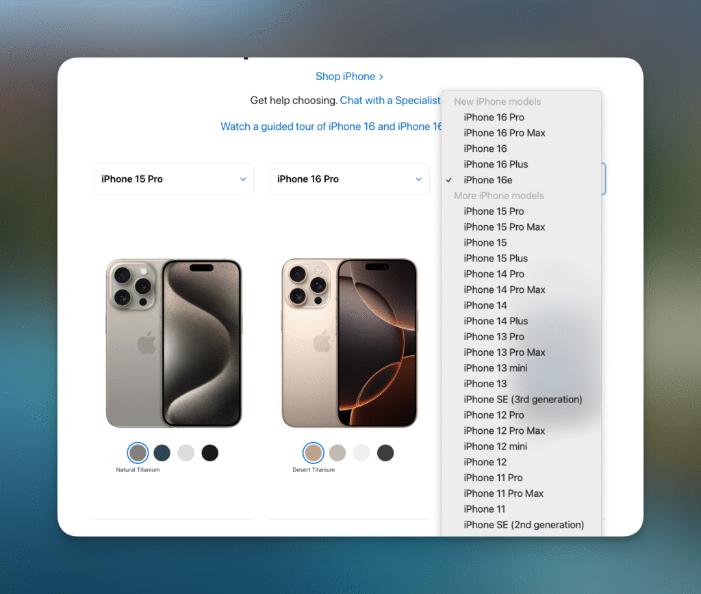
Here’s a question I’ve been asked a lot lately: What’s really different about the iPhone 16? On the surface, it doesn’t seem like much, does it? If you put the iPhone 16 vs. 15 side by side, you might struggle to tell them apart.
But here’s the thing: innovation doesn’t always announce itself with fireworks. Sometimes, it’s about the subtle changes — the ones that fly under the radar but make all the difference when you actually use the product.
That’s what fascinates me about the iPhone 16 and iPhone 15 comparison. It’s not a redesign; it’s a refinement. And when you dig into the details, you realise Apple’s decisions reveal a lot, not only about the evolution of iPhone design but about design philosophy and the challenges of product concept development.
Let’s explore the iPhone 16 vs. 15 differences and what they teach us about the future of design.
A quick iPhone 15 vs. 16 comparison
Let’s get into the nuts and bolts. What’s actually new about the iPhone 16? It’s not a revolutionary leap forward, but it doesn’t need to be. Instead, Apple has doubled down on refining the details.
The Camera Control button
This is the kind of design feature that makes me geek out. Apple added a small, touch-sensitive button on the lower-right side of the iPhone 16, and it’s a game-changer for photography.
- User-centred functionality: This button lets you zoom, adjust focus, and snap photos directly without opening the app. It’s an intuitive response to how people actually use their phones.
- A step toward tactile interfaces?: While iPhones have largely moved toward all-screen functionality, features like this could mark a subtle return to tactile interaction, showcasing the importance of user interface prototyping in creating intuitive designs.
A fresh coat of paint
The iPhone 16 introduces new, softer tones. While this might seem like a superficial change, it’s anything but. Colour is one of the fastest ways to signal newness and differentiate a product.
- Emotional impact: Colour isn’t just about aesthetics; it triggers feelings. A sleek, muted palette can evoke sophistication, while bolder colours might attract younger users.
- Brand evolution: Apple has used colour shifts strategically over the years, from the playful tones of earlier models to the more mature shades we see now.
Titanium’s time to shine
Apple’s move to a titanium frame for the iPhone 16 is a nod to material innovation.
- Form meets function: Titanium is lighter than stainless steel yet stronger. It enhances durability while giving the phone a premium feel — a quality users notice the moment they pick it up. Through materials design analysis, Apple has crafted a frame that balances strength and usability.
- Sustainability in disguise: Using durable materials extends the device’s lifespan, aligning with growing consumer demand for sustainable product design.
Slimmer bezels, bigger impact
This isn’t just about aesthetics. Thinner bezels create a more immersive screen experience, and the subtle refinement makes the device feel sleeker and more modern.
iPhone 16 Pro vs. iPhone 15 Pro
When it comes to Apple’s Pro models, the story often shifts from subtle refinements to pushing boundaries for power users. The iPhone 16 Pro vs. iPhone 15 Pro comparison isn’t just about tweaks — it’s about delivering tools for those who demand more from their devices.
Pro-level materials and build
The shift to a titanium frame isn’t exclusive to the base models — it’s here in the iPhone 16 series, too. But for the iPhone 16 Pro, this material change feels even more significant.
- Durability meets luxury: Titanium offers strength while reducing weight, making the iPhone 16 Pro Max feel lighter and more premium compared to the iPhone 15 Pro’s stainless steel build.
- Tactile feedback: Materials define how we perceive a device. The titanium frame provides a smoother, less fingerprint-prone surface, creating a more satisfying tactile experience.
Performance leaps in processing power
Both models feature Apple’s cutting-edge chipsets, but the iPhone 16 Pro introduces the A19, offering enhanced thermal efficiency and even faster performance compared to the A18 chip in the iPhone 15 Pro.
- Improved workflows: Whether editing high-resolution video or rendering AR graphics, the iPhone 16 Pro’s processing power minimises delays and maximises productivity.
- Energy optimisation: The efficiency of the A19 extends battery life during power-heavy activities — a win for users who push their devices to the limit.
The display advantage
While both the iPhone 15 Pro and iPhone 16 Pro boast ProMotion technology, Apple’s enhancements to the 16 Pro’s display refine the visual experience even further.
- Peak brightness levels: The iPhone 16 Pro Max takes outdoor readability to new heights, delivering unmatched clarity even in direct sunlight.
- Thinner bezels, immersive views: The 16 Pro’s thinner bezels create a more immersive screen experience, perfect for creatives and gamers who rely on every inch of real estate.
Camera innovations
Apple continues to lead in mobile photography, and the iPhone 16 Pro vs. iPhone 15 Pro camera comparison highlights how small upgrades can significantly elevate outcomes.
- New camera control: The introduction of the camera app-enhancing camera control button on the iPhone 16 Pro offers a new way to interact with the device. Zoom, adjust focus, and snap pictures without entering the app — it’s an intuitive tool for seamless photography.
- Improved low-light performance: The main camera features advancements in sensor technology, capturing brighter, more detailed images in challenging lighting conditions.
- Pro-level video tools: New video stabilisation modes and expanded ProRes capabilities make the iPhone 16 Pro the go-to device for content creators on the move.
MagSafe and ecosystem improvements
The iPhone 16 Pro continues Apple’s commitment to a seamless ecosystem with enhanced MagSafe functionality, allowing for faster charging and better accessory integration.
So, why do iPhones all look the same?
Every time a new phone is announced, I hear the same grumbles: “Why does it look exactly like the last one?” And honestly, I get it. From the outside, it feels like iPhone evolution has hit a wall. But if you look deeper, you’ll see it’s not about laziness — it’s about something far more complex: maturity.
Function as the ultimate design constraint
iPhone design (and more broadly, consumer electronic device design) isn’t driven by aesthetics alone — it’s driven by solving real problems.
- Ergonomics and muscle memory: Users expect their phones to feel intuitive. The slab form factor isn’t a design failure — it’s an ergonomic product design solution that prioritises usability and familiarity.
- Balance of trade-offs: Change the shape, and you compromise battery size, pocketability, or screen real estate. Every design decision is a trade-off, and the rectangle is simply the most efficient solution.
The tyranny of shared technology
Another reason phones look alike is the shared ecosystem of components that underpin them.
- Component convergence: From OLED displays to multi-lens cameras, manufacturers are using similar tech from the same suppliers. With limited differentiation in hardware, external designs naturally converge.
- Barriers to experimentation: While exciting concepts like foldable screens exist, they come with limitations — durability, cost, and bulk — that prevent them from replacing the slab design just yet.
iPhones aren’t just designed to be practical — they’re designed to work within the constraints of current technology.
Why small changes matter more than big ones
Hype culture celebrates breakthroughs, but meaningful design often happens incrementally. The iPhone 15 vs. 16 comparison illustrates a masterclass in micro-innovation: small changes that deliver outsized impact.
The beauty of refinement
Take the Camera Control button. It’s not a headline-grabbing feature, but it quietly improves the way users interact with their cameras. This is what great design looks like: solving specific problems without adding unnecessary complexity.
Lessons from other fields
Incremental innovation isn’t unique to iPhones.
- Automotive design: Cars evolve incrementally, with each new model introducing subtle tweaks to safety, efficiency, or comfort. These changes might not be flashy, but they make driving better.
- Design longevity: The longer a product category exists, the more focused innovation becomes. In mature categories like smartphones, the goal isn’t reinvention — it’s perfection.
Small changes don’t dilute a product’s identity — they strengthen it by building on a foundation that users already trust.
The cultural significance of iPhone design
iPhones are more than tools — they’re cultural artifacts. Their design reflects societal priorities and values, from the rise of minimalism to the push for sustainability.
Minimalism and luxury: two sides of the same coin
Apple’s design philosophy embodies a tension between simplicity and opulence.
- Minimalist aesthetics: Over the years, the iPhone has become sleeker and cleaner. This isn’t just about design trends — it’s a reflection of cultural values that prize decluttering and efficiency.
- Luxury signals: At the same time, features like polished titanium frames and exclusive colour palettes elevate the iPhone as a status symbol. Apple isn’t just selling a phone — it’s selling an experience.
Sustainability as a design imperative
Apple’s use of recycled materials is a testament to the growing importance of sustainable and eco-friendly product design, reflecting a cultural shift toward responsibility and accountability.
- Circular economies: Recycled materials reduce waste and signal a commitment to sustainability. This isn’t just good PR — it’s a response to consumer demand for ethical practices.
- Emotional resonance: Knowing your phone was made responsibly creates a deeper connection between you and the product. It feels good to own something that aligns with your values.
What’s next for iPhones?
Imagining the future
The slab design isn’t going anywhere, but that doesn’t mean innovation has stopped. The iPhone 16 specs vs. 15 show how even within familiar constraints, there’s room to innovate.
As we look forward, the integration of technologies like augmented reality and connected devices signals an exciting direction. This aligns with the goals of IoT product design, where functionality and user experience are tightly interconnected.
- Foldables: Foldable screens hint at a more flexible future, where devices adapt to users’ needs rather than the other way around.
- AR integration: Augmented reality could fundamentally reshape how we interact with technology, turning the physical world into an interface.
Challenges ahead
Innovation always comes with obstacles. Foldables need to become more durable and accessible. AR requires leaps in hardware and software. But solving these problems is what makes design exciting — it’s where the real breakthroughs happen.
What Apple teaches us about design
Apple’s genius doesn’t lie in dramatic reinventions. It lies in understanding the user, working within constraints, and delivering products that quietly transform how we live.
- User needs first: Features like the Camera Control button solve real problems rather than chasing trends.
- Emotion matters: Design isn’t just functional — it’s personal. Every material, colour, and curve is a deliberate choice meant to connect with users on a deeper level.
Final lessons from the iPhone 16
The iPhone 15 vs. 16 differences might not be revolutionary, but that’s precisely the point. Apple’s approach reminds us that innovation doesn’t have to be loud to be meaningful. It’s not about overhauling the familiar — it’s about refining it, finding the small yet significant ways to make a product better.
This philosophy resonates deeply with us at Paraform. Like Apple, we believe the best designs don’t just solve problems — they anticipate needs. They work seamlessly with users’ lives, combining subtle improvements with bold thinking. Whether it’s iterating on an existing idea or creating something entirely new, thoughtful design considers every detail, from the materials we use to the emotional connections we create.
Key takeaways for designers and innovators
- Start with the user: True innovation comes from understanding the people who will interact with your product. Apple’s Camera Control button is a perfect example — it’s small, but it changes how users capture the world around them.
- Design within constraints: Challenges aren’t obstacles — they’re opportunities to think smarter. The titanium frame and slimmer bezels show how Apple innovates without compromising functionality.
- Think long-term: Sustainable materials and subtle refinements aren’t just good for the environment — they build trust and loyalty with users who value durability and ethical design.
At Paraform, these principles guide everything we do. From product concept development to prototyping and manufacturing, we work closely with our clients to create designs that balance practicality with beauty, innovation with reliability. Like Apple, we know that the smallest decisions can make the biggest impact.
So, what’s your next design challenge? Whether you’re refining a product or starting from scratch, let’s collaborate to create something thoughtful, functional, and truly impactful — because great design doesn’t just work; it resonates.